

by Lil Tuttle
Throw out what you thought you knew about inequality in the U.S. Neither the Left nor the Right "knows what it is" or "has a comprehensively and conceptually correct measure of inequality," argue economists Alan Auerbach and Laurence J. Kotlikoff. "Our findings dramatically alter the standard view of inequality and inform the debate on whether and how best to reduce it."
In a just-released study, we provide the first picture of actual U.S. inequality. We account for inequality in labor earnings and wealth, as Thomas Piketty and many others do. And we get to the bottom line: what does inequality in spending look like after accounting for government taxes and benefits?
The final picture will surprise both sides of the ideological divide. The standard view of inequality fails to consider one critical element: people's spending power. What did researchers learn?
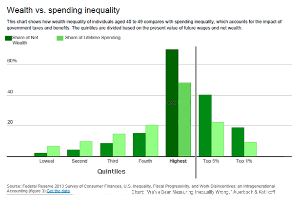
First, spending inequality – what we should really care about – is far smaller than wealth inequality. This is true no matter the age cohort you consider.
Our study focuses on lifetime spending inequality because economic well being depends not just on what we spend this minute, hour, week or even year. It depends on what we can expect to spend through the rest of our lives.
Researchers' bottom line: The fiscal system in the U.S. "does materially reduce inequality, not in what people own or earn, but in what they get to spend" over their lifetimes. The above chart, using the aged 40 to 49 cohort, illustrates their findings:
The fact that spending inequality is dramatically smaller than wealth inequality results from our highly progressive fiscal system, as well as the fact that labor income is distributed more equally than wealth.
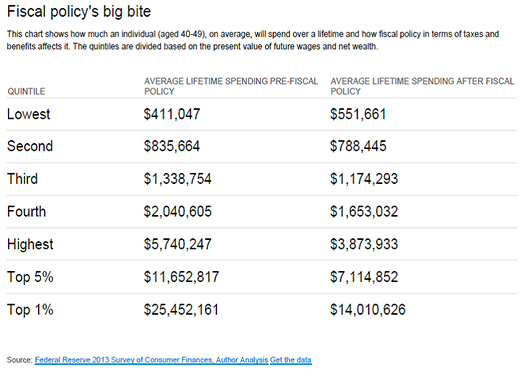
The top 1 percent of 40-49-year-olds face a net tax, on average, of 45 percent. This means that the present value of their spending is reduced by the fiscal system to 55 percent of the present value of their resources. So someone in that age group who has resources with a present value of US $25.5 million can spend $14 million of it after fiscal policy.
For the bottom 20 percent, the average net tax rate is negative 34.2 percent. In other words, they get to spend 34.2 percent more than they have thanks to government policy (they get to spend, on average, $552,000 over their lifetimes, which exceeds their $411,000 in average lifetime resources).
Auerbach and Kotlikoff acknowledge that their findings will upset the ideological status quo in the debate about inequality, but the "facts revealed in our study should change views."
Inequality, properly measured, is extremely high, but is far lower than generally believed. The reason is that our fiscal system, properly measured, is highly progressive. And, via our high marginal taxes, we are providing significant incentives to Americans to work less and earn less than they might otherwise.
Finally, traditional static measures of inequality, fiscal progressivity and work disincentives that a) focus on immediate incomes and net taxes rather than lifetime spending and lifetime net taxes and b) lump the old together with the young create highly distorted pictures of all three issues.
In short, liberals and conservatives need to reevaluate their talking points. Liberals’ proposals to raise taxes and benefits “come at the cost of even larger work disincentives” unless existing tax and benefit systems are properly reformed. Yet conservatives’ proposal to lower taxes “may only exacerbate spending inequality unless the benefit cuts disproportionately hit the rich.”
The good news, say researchers, is that “we now have the machinery in place to accurately assess fiscal reeforms in a manner consistent with economic theory and common sense.”
The study was a massive, multiyear undertaking that factored in survival scenarios, income, "copious provisions" of personal income taxes, and lifetime government benefits. Researchers drew data from the Federal Reserve's 2013 Survey of Consumer Finances (SCF) to calculate and compare the lifetime spending inequality across five quintiles (the lowest quintile having the lowest amount of resources, etc.), as well as the top 5% and the top 1%. The data were further grouped into age cohorts (30-39, 40-49, etc.). Below is the data table of the above chart:
Source: We’ve Been Measuring Inequality Wrong – Here’s the Real Story, by Alan Auerbach, Robert D. Burch Professor of Economics and Law and Director, Burch Center for Tax Policy and Public Finance, University of California, Berkeley; and Laurence J. Kotlikoff, Professor of Economics, Boston University, The Conversation